
The Cricut foil transfer tool was introduced with a lot of fanfare in September 2020, but interest seemed to fall off pretty quickly. Why?
A lot of users – including me – felt the tool was difficult to master. I wasted a ton of those foil sheets messing up on so-so projects where the foil failed to transfer, or the sheet ended up getting bunched up and pulled out from under the tape. I even tried alternatives to the foil tool, like metallic markers.

But I still love the foil tool. There is no substitute for the rich, textured look you can achieve with this tool. A lot of practice has taught me how to make the most of it. In this article I will cover techniques to make using the tool easier. I’ll also share some images and fonts that I think make foiling worthwhile.
Let me help you get excited about this unique tool again!
The Cricut foil transfer tool: a unique pressure-sensitive foiling system
I’m not going to get into a super detailed explanation of the basics of the foil transfer kit in this article. If you’re a beginner with the tool, you can get the basics in our foil transfer tool introduction article.

Briefly, the foil transfer tool has 3 different tips – fine, medium, and bold – that vary in terms of their sharpness. Fine tip is the sharpest for a thinner line. Bold has the bluntest tip and should be used with more pressure to create a reasonable imprint if you’re using an Explore machine.
The tips are used to press down on pressure-sensitive foil sheets taped shiny side up over the area to be foiled, usually on cardstock/poster board/etc.
Because the foil tool works using pressure, you can use it without foil to deboss, but the results aren’t great. If you want to deboss using the Maker, get the Debossing tip. If you want to deboss using the Explore machines, use the Scoring Stylus. Go over your design twice – it will give you a better imprint than the foil tool.
Our tips, tricks and hacks to get the best results with the Cricut foil tool
Now that we’ve quickly covered the basics of how the tool works, let’s have some real talk about what works, what doesn’t, the best way to get impressive results and what not to waste your time on.
Our number one piece of advice for using the foil tool: don’t stick with easy/basic images and fonts – ornate is great!
Choosing images: embrace designs with many fine lines


Here’s my biggest tip: intricate line drawings are the best use of the foil tool. The results will look great, but don’t take any more time or effort than simple designs.
- The more fine lines your design has, the more impressive the results will be. These types of designs almost always require just the fine tip and look beautiful even in single colors. Intensively foiled gold or silver designs on black/dark backgrounds make amazing wall art and gifts that will be treasured.
- Choose projects specifically for drawing, and don’t expect the foil to look good filling in large areas. Cricut Access has a lot of beautiful line drawings that can be foiled.
- Anything Art Deco is perfect for this tool. You can easily foil designs and patterns for cards and envelopes that will look fantastic in gold or silver
- This may be controversial, but don’t bother using the foil tool for simple projects like gift tags, labels or basic thank you cards. Glitter gel pens or metallic markers do just as well for easy projects.
Cricut Foil Transfer Fonts: choose the right font for your project!
Foiling Writing Fonts

I love writing fonts, but single line fonts rarely showcase foiling effects in a way that justifies the hassle. Most of them look great in just easy-peasy glitter gel pen.
My advice: if you want to use a writing font, use either a beautiful script or an embellished display writing font. The only writing fonts I use for foil are the elegant Single Line Fonts, like RSVP or Black Tuxedo. Pictured left is the inside of a sympathy card I foiled using RSVP and image #M28D35B from Design Space. Our article on writing fonts for Cricut has many examples of single line fonts you can find for free.
I have also foiled some examples of Cricut scripts or embellished writing fonts that I think look particularly good in foil. These are all either writing fonts, or fonts where I have foiled the writing style only.

To use a Cricut writing font for foiling:
- go to the Style pulldown menu and choose “Writing“
- go to the Operation menu, choose “Foil” > “Fine” (or “Medium” or “Bold”)
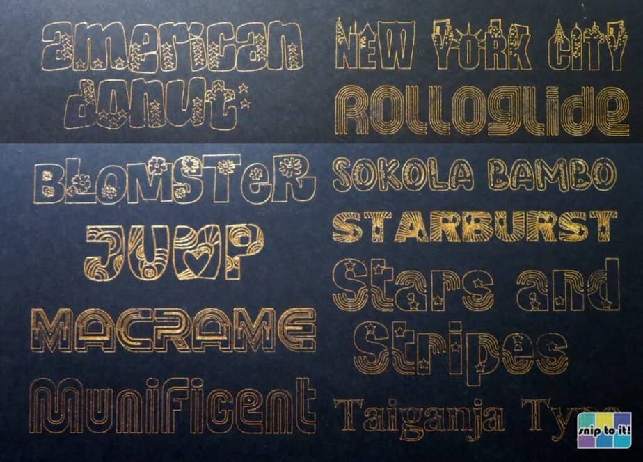
This image is zoomed in quite a bit…the actual width of all of these fonts is just 2.75 inches. My personal favorite is Agent Q. But I do love the tiny heart, tree, and snowflake details in the other display fonts here. The fine tip foiled them perfectly.
Foiling Display Fonts: Cricut Cutting Fonts
My advice for picking a font worth foiling is just like picking an image worth foiling: fancier with more fine lines is better. Among Cricut fonts, the most interesting display fonts tend to be cutting fonts. I have foiled a selection of my favorites. Go through the slideshow to check out the detail on fonts like Saphir; the phrases are all 5″ wide and have corresponding heights of ~0.5-0.75″ tall.
To use a Cricut cutting font for foiling:
- go to the Style pulldown menu and choose “Regular“
- go to the Operation menu, choose “Foil” > “Fine” (or “Medium” or “Bold”)


Foiling Display Fonts: Free Fonts
There are thousands of interesting fonts beyond Design Space that have integrated lines, hatches or other embellishments. A multi-line retro font like Rolloglide is a perfect example. This font is a variation of Bauhaus, and the integrated lines gives it a filled in look.
Other font styles you can browse for foiling projects are fancy or decorative display fonts. Here’s a variety of my favorite display fonts – check out the slideshow for closeups. (I foiled this all in one go on a 12″x12″ sheet of cardstock with a gold foil sheet I cut to 12″x9″. I spent at least 5 minutes getting my foil pulled tight so it wouldn’t mess up. It took 25 minutes to foil.)


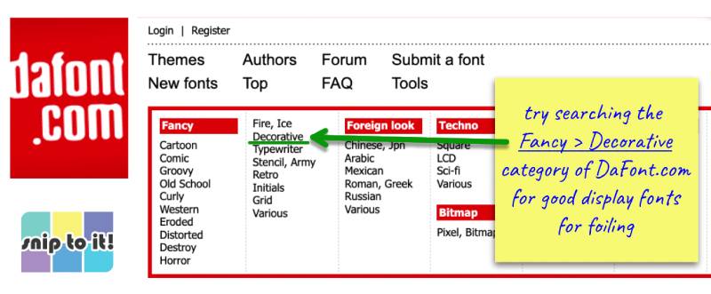
Download these fonts for free from Dafont.com and/or fontspace.com:
My go-to free font site is normally fontspace, but Dafont has better categories for finding good display fonts:
Explore machines: use the fine or medium tips for everything
If you look at Cricut’s foiled card projects in Design Space, you’ll notice that virtually all of them use just the fine tip. In my experience, the fine tip provides the most consistent foil application with the least patchy results.
If you have an Explore Air 2, this is definitely true. You won’t get great foil transfer will the blunter tips, because the machine just doesn’t use enough default pressure. If you use medium or bold tips with an Explore machine, always use the “more pressure” setting.
Makers: use the tips with default or less pressure
Makers seem to use more default pressure for the foil tool in general, although your individual machine will have its own calibration. If your Maker tears up the foil sheet or cardstock, use less pressure and maybe try a blunter tip.
On average, though, Makers will do very well transferring foil with the fine, medium, or bold tip with “default” or “less pressure”. Do a test run with your Maker or Maker 3 before you jump in to a whole project.
Know the limits of the foil tool and your patience
- I recommend using only 1 or 2 different foil colors for each design. Having to tape and remove foil on the same mat many different times will drive you insane and increase the likelihood of mistakes.
- If you are mixing fine, medium and bold tip lines in your design, you only get one opportunity to set the pressure on the Set Load and Go screen. Whatever you set for the first line is what you are stuck with for the rest of the foiling operation. My advice? Just use the fine tip for everything.
- Projects made in panels are the easiest to master. The fewer things you need to go right on one mat, the better
- The 4×6″ foil sheets aren’t that great for making cards, because every image has to be ~1/4″ smaller than that on all sides to tape all around. It’s a bad fit for 5×7″ cards, and if you want to do something like make an Art Deco or ornate frame around something, you’ll have to get the 12×12″ sheets.
Executing your designs: how to use Cricut foil transfer effectively
Managing project placement on the mat
Place your base (i.e. cardstock/kraftboard/etc.) low on the mat.
- If using a 12×12″ mat, I like to position my cardstock down 3″ from the top.
- If using a 12×24″ mat, I like to place cardstock at the 6″ mark. This gives you room to change/remove foil while your mat is in the machine.
- If you’re only foiling a small part of your cardstock, you can also just set up your foiling on the lower part of your mat in Design Space
Once your project is in the machine, it will score (if that’s part of your project), foil, then cut. You may have to tape your foil on while your mat is in the machine, so aren’t you glad you gave yourself room?

How to use foil transfer sheets without losing your mind
The most time you spend on a foil project will be setting up your foil and taping it down. Do not try to save time on this step! You may need to tape and re-tape to get your foil pulled tight and taped securely on all sides, but it will be worth it. Also, NEVER touch foil sheets directly to the mat – the foil residue will never come off.
- It’s handy to have at least 1 pack of 12×12″ foil sheets. It comes with long strips of tape that can be cut to fit smaller foil sheets. You want the whole side of the sheet taped down, and the 4″ tape strips are too short. You can reuse the tape strips many times.
- First, tape one side of your sheet then the opposite side, pulling the sheet tight. I like to start with a long side first. When one side of the sheet is taped down, grab the opposite side with tape. Pull it tight before tacking it to the cardstock. Re-tape if you have to, because getting the tape as smooth and tight as possible is important.
- At least 1/3 of the tape width should be on your foil. Too little tape on the foil will allow it to be pulled out from under the tape while foiling.
- If your foil and tape are staticky, run a dryer sheet lightly over the edge of your foil. Don’t rub or use force, just gently pass it over.
- When finished, peel the tape off at a low angle (close to the mat). Go slowly, as the tape can damage the finish of the cardstock if peeled too quickly.
- Keep your tape for all kinds of projects: I use it to stick down curled vinyl on my mat. You can also use it to tape down thick materials when cutting with the Maker

Troubleshooting common complaints: “My Cricut foil transfer is uneven”
(or “My Cricut Foil rubs off” or “My Cricut Foil is not transferring”)
Most blogs will tell you that your foil transfer is uneven or rubbing off because the mat is dirty. In certain cases this might be true. You can scrape any leftover paper or adhesive debris off the mat. Some people claim they use a lint roller on their mat but I have *never* had this work for me. The lint roller paper just ends up sticking to the mat. If you’ve mastered this, let me know!
What I’ve found is the more common cause for uneven foil transfer is using the medium or bold tip without enough pressure. More to the point, when I try to fill in too large of a space with the foil tool, the results are often patchy and uneven.
If you are having trouble with gaps or uneven application, there are a few things you can check:
- Do you have the right tip loaded?
- Does your base material match the material you set in Design Space?
- Is your foil pulled tightly over the base layer? Are there wrinkles in the foil or is the tape loose?
- Don’t let your tape cover the design area
- Make sure your Cricut machine is working on a stable surface. A wobbly table can skew the down force of the Cricut, throwing off the foil tool results. If you have to, try placing your machine on the floor (not carpet obviously).
- If there are gaps or lines missing from your text, try ungrouping the text block in Design Space and attaching each of the letters.
- If your foiling rubs or flakes off badly, then it may be because you have used the bold tip or you have over-foiled an area (like filling in with many fine lines). If you want a design that lasts, use the fine tip/fine lines in your design

Final Thoughts
As I said in the opening of this article, the foil transfer tool is finicky, but great results are hard to argue with. I still use this tool for projects all the time, but only for people I adore, so I’d have to say the time is well spent. Don’t leave foiling until the last minute, and put your foil projects firmly in the ‘labor of love’ category and you will be delighted!
Did I miss anything? Do you have secret tips for the foil tool, or still have questions I didn’t cover? Leave us a comment!
Image credits
- Japan ocean wave seamless black background by Issara Jarukitjaroon via vecteezy.com
- Hand drawn dandelion floral illustration by Sudarat Wiairat via vecteezy.com
This is the most helpful article I have read on the Cricut Foil tool!! Thank you very much! I’m expecting great results
Thanks for the feedback! I hope your foil projects turn out great! – Kerri
Thanks for this! I do have one more question, though. What about paper? What papers are you using for your examples, and what papers do you find work best?
Hi Kay,
I only ever foil on smooth cardstock, and my examples in the article are all on Recollections 65 lb cardstock from Michaels. Thanks for reading! – Kerri
Hi! I was wondering if you have any suggestions/tips for if I have a project with a larger foiled design than my sheets? I have a lot of 4×6 transfer sheets I got with a bundle, but I want to make bigger designs. I can buy the bigger sheets, but…I fear these smaller ones will just go to waste.
Hi Kelly,
I also discovered pretty quickly that most of the designs I wanted to do were larger than what I could make with the 4×6″ sheets, especially since you have to allow for a narrow margin at the edges where you’ve taped the sheet. Some designs can be foiled in sections, but it really depends on the design. Because you have to tape the sheets tight on all sides, they can’t be tiled, and you can’t reliably foil over the tape, so you can’t just tape them into 1 large sheet.
Using the foil tool can be tricky enough without the headache of trying to cobble together irritatingly tiny sheets, so my personal preference is foiling only smaller images or text (typically on 4×6″ cards) with the small sheets. I will often foil multiple colors on a larger overall design, though (think fireworks, flowers, etc.). I do love the wider color selection of the small sheets.
Ultimately, though, if you want to foil a big single-color design, don’t hesitate to use the larger sheets. Sometimes I just prefer being able to have a large margin on all sides of my project, so I don’t have to use a just-fit sheet size.
Best of luck with all your foiling! It can take some time to set up, but the results can be amazing. Thanks for reading! – Kerri