
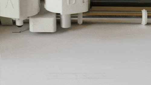
If you make cards with your Cricut or other cutter, you’ve probably discovered that not all fonts write the way you expect. Instead of a solid line, they come out as hollow bubble letters:

Your projects are too good for sub-par results and boring typefaces! Join me as I map out the world of fonts that look like single lines when written.
This article will cover everything you need to know about writing fonts for Cricut, Silhouette, Siser, or other cutting machines. I have included a printable cheat sheet to all the Cricut writing fonts, plus a list of 167 FREE fonts that have been tested for their writing results.
Quick Navigation (jump ahead)
Writing Fonts: an Explainer
There is a myth that Cricut writing fonts are single lines, drawn in a single pass, and that system/free writing fonts are simply very thin fonts that are written as an outline. No font in Cricut Design Space is drawn in a single pass, not even the Cricut writing fonts.
Font files – like TrueType (.ttf) and OpenType (.otf) – are a type of vector file. When Design Space “writes” them, it’s actually tracing the outline of each letter like it does with any vector shape (e.g. SVGs). To draw letters, the machine starts at one corner, draws the length and returns to the starting point to close the shape. Writing fonts that look like single lines have their second, ‘return’ line drawn directly on top of the first one.
True single line fonts (open path fonts, .opf), which consist of a single stroke, are NOT compatible with Design Space (or most other cutter/plotter software). It’s not that Design Space can’t handle open paths (it can!), it’s that ttf and otf font files are not created with open paths. That’s OK! There are tons of fonts that will look like a single line, even when written with extra fine point pen!
To get that single line look, fonts will either be:
- extremely thin, so the outlines are close enough together to appear as a single line when written, or
- fonts where the strokes are drawn right on top of each other (these need to be ungrouped and Attached to use in DS)
Cricut Pen/Writing Fonts Available in Design Space
Cricut Design Space has a selection of over 500 fonts that have a writing style specifically to be drawn instead of cut. Most of these write as a single line, but many (>180) are open/outlined. To see them:
- Create a text box on the canvas (click the “Text” option in the left hand menu)
- Open the font menu by clicking on the font name (default = Cricut Sans) in the top toolbar
- Select the Cricut fonts tab
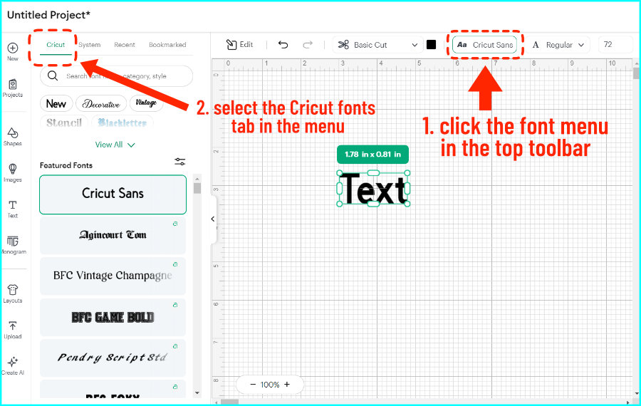
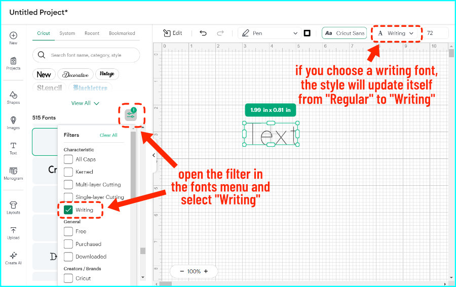
- Click the filter icon in the top right corner (two small horizontal lines) and select Writing to see just the writing fonts
When you select a Cricut writing font, the default line type will be pen and the default style will be Writing instead of Regular.
The catch is that only 26 of these fonts are free, and the rest are for Cricut Access members only (or you can pay a fee).
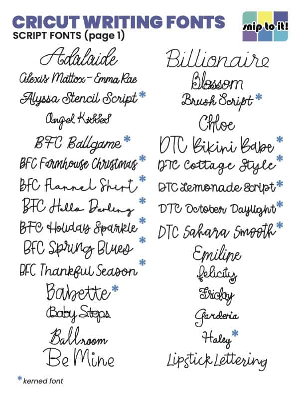
All the Cricut Writing Fonts + Cheat Sheet (PDF download)
We created an at-a-glance list of all the Cricut writing fonts and categorized them according to visual style. Also included are a list of collections and a list of fonts that have a fee even for Access members. We update the guide regularly, so you can print update pages when we add them!
Click through the slideshow to view each category and the new updates:

Cricut Regular Fonts p1 Cricut Regular Fonts p2 Cricut Hand Printed Fonts p1 Cricut Hand Printed Fonts p2 Cricut Hand Printed Fonts p3 Cricut Fancy Hand Printed Fonts p1 Cricut Fancy Hand Printed Fonts p2 Cricut Script Fonts p1 Cricut Script Fonts p2 Cricut Display/Open/Novelty Fonts p1 Cricut Display/Open/Novelty Fonts p2 Cricut Display/Open/Novelty Fonts p3 Cricut Display/Open/Novelty Fonts p4 Cricut Font Collections p1 Cricut Font Collections p2 new Cricut fonts Sept 2023 page 1 new Cricut fonts Sept 2023 page 2


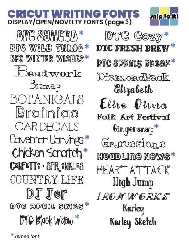


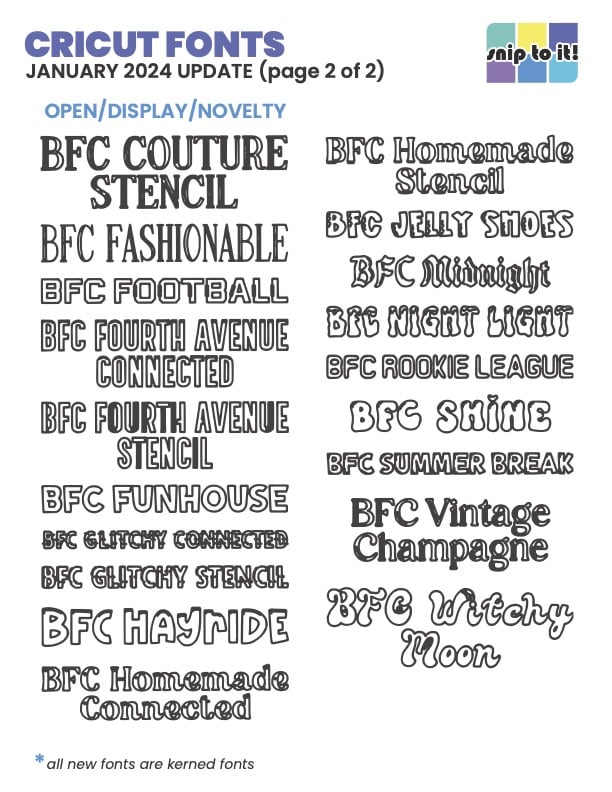
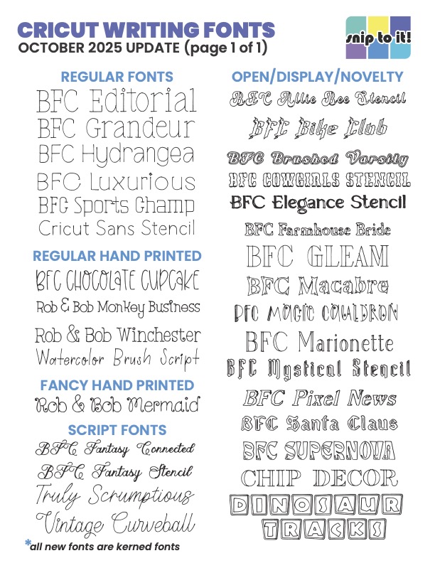
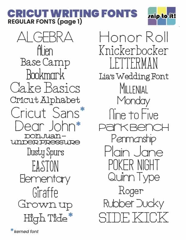
Each font was written at either 3.25″ wide or 0.5″ tall. This should give you an idea of the type size you should use for each font. Fonts were written in 0.4mm pen (October 2025 update in 0.3mm pen) and scanned, except for the fonts requiring an additional fee (that’s a screenshot – no way am I paying for those!).
Click here for my printable guide to all of the writing fonts available in Cricut Design Space. Just scroll until you see “Cricut Writing Font Guide” on the Resource & Download Library page and click to download.
We really appreciate the interest in our guides and tutorials. If you’d like to get notified when we have new resources, projects and stories available, please consider joining the Snip to It community and sign up for our newsletter below:
What does BFC mean in Design Space?
Most writing fonts added to Design Space in the past couple of years are fonts with the prefix “BFC“. BFC stands for Blush Font Co., the studio that designed the fonts. They were formerly called Dixie Type Co. – hence the DTC fonts you can also find in Design Space – and changed their name.
Likewise, ITC = International Typeface Corporation. DIN = Deutsches Institut für Normung. FF = FontFont.
What is kerning in Design Space?
Kerning is the spacing between letters in a font, and what “kerned” means in Design Space is that the program can read this information from the font file. New DS fonts are all kerned, and you’ll find that updates to DS seem to have fixed a lot of weird spacing problems between characters. I really like a lot of the old fonts so I don’t care if a font is listed as kerned or not.
Free Writing Fonts
This is my curated list of free writing fonts that work beautifully with any cutting machine: Cricut, Silhouette, Siser, or others. These come from fontspace, DaFont, and Google Fonts but you can always search your own favorite font site using terms like “thin” “hairline” or “light“. Don’t use “monoline” – monoline means that the font has strokes of uniform thickness, not that the font is a single line.
EVERY font I recommend here has been downloaded and tested to write with little to no bubbling/hollow spots.
The fonts all come with a full English alphabet and are free for personal use. They have been categorized as:
- script/cursive
- sans serif
- serif
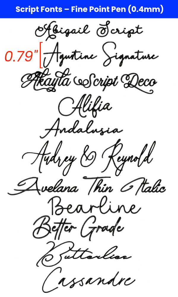
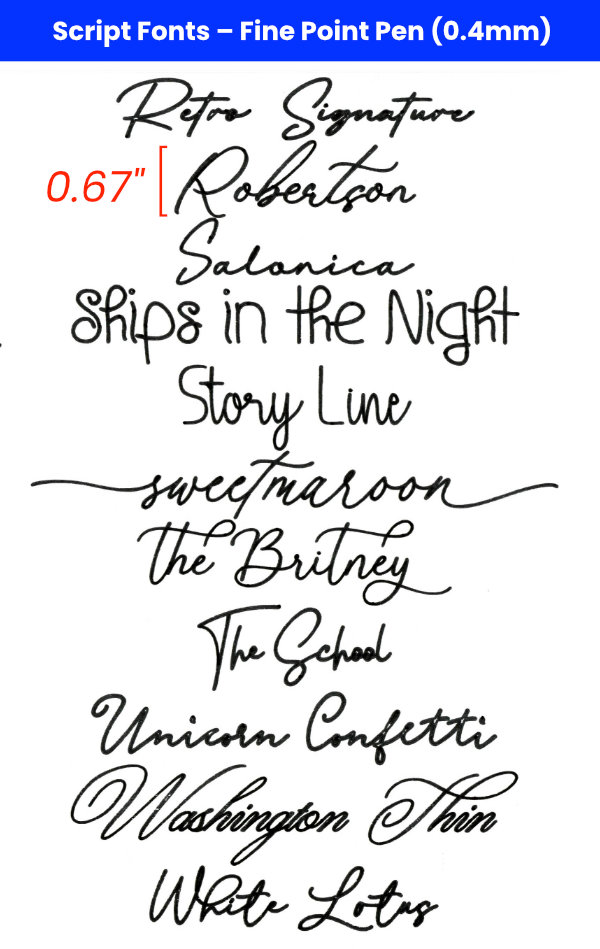
All fonts were written using an Extra Fine Point (0.3mm) or a Fine Point (0.4mm) pen. The very thinnest fonts in each category are the ones listed first. Scale bars are included to give you an idea of font size.
There is a separate section for free fonts designed by Single Line Studios because these fonts require special instructions for use.
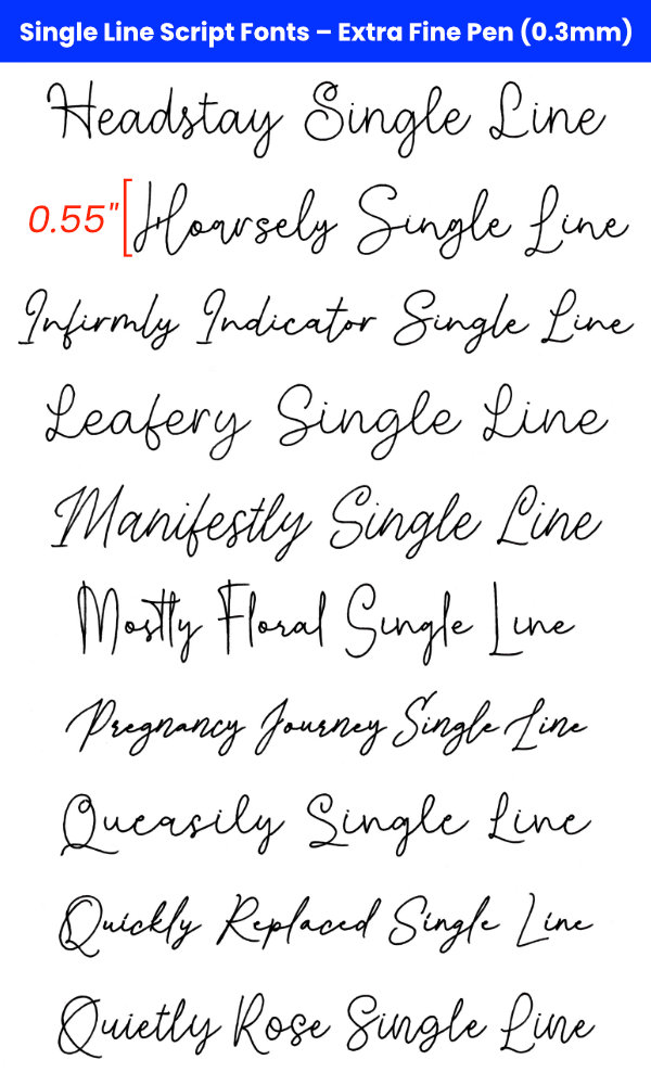
Free Cursive Writing Fonts
Cursive fonts are by far the most popular writing fonts. Use these scripts for wedding invites, holiday or birthday cards, elegant place cards, gift tags, and more. The thinnest of these fonts are written in 0.3mm pen and are listed first.

- Blueberry & Jasmine
- Caneta Script Thin
- Chrysante Thin
- Encina Script 1
- Honey Bunney Script
- Ocean View
- Respondent Thin
- Rumah Singgah
- Silent Caroline
- Washington Thin
The second set of cursive fonts is written with a Cricut Fine Point (0.4mm) pen.


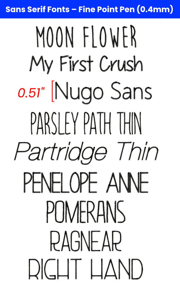
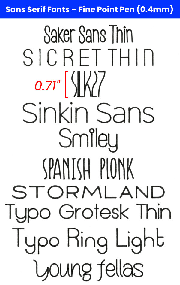
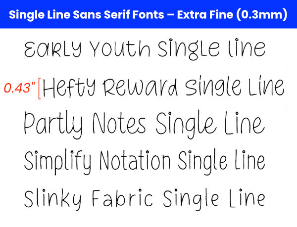
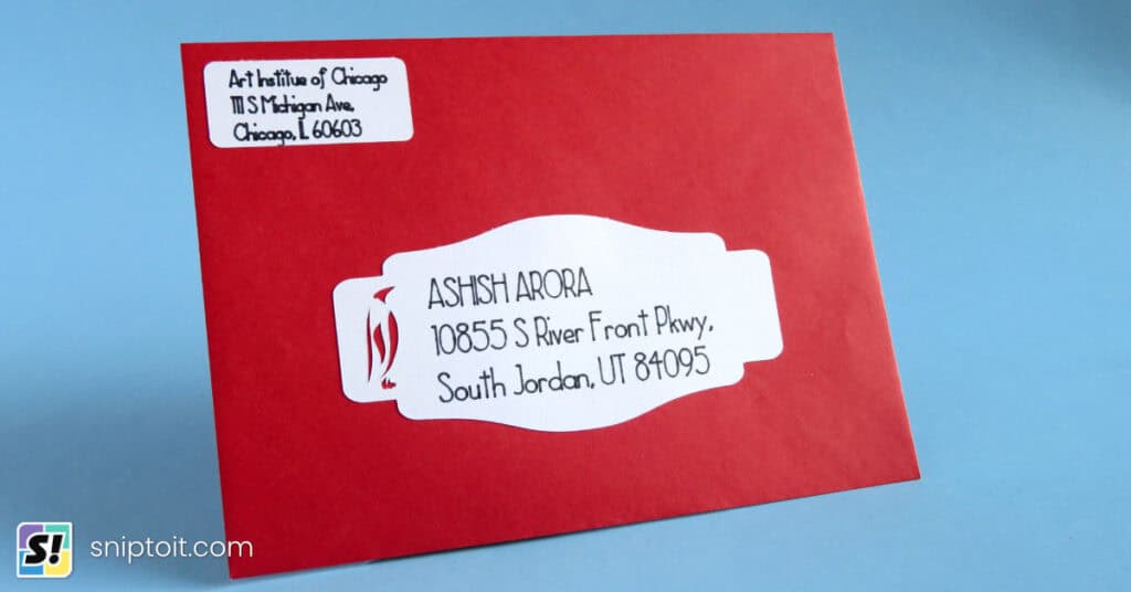
Free Sans Serif Writing Fonts
These are some great fonts for addressing envelopes or creating clean and crisp text in cards or invitations. The first set are the thinnest fonts, written in Extra Fine Point (0.3mm) pen.

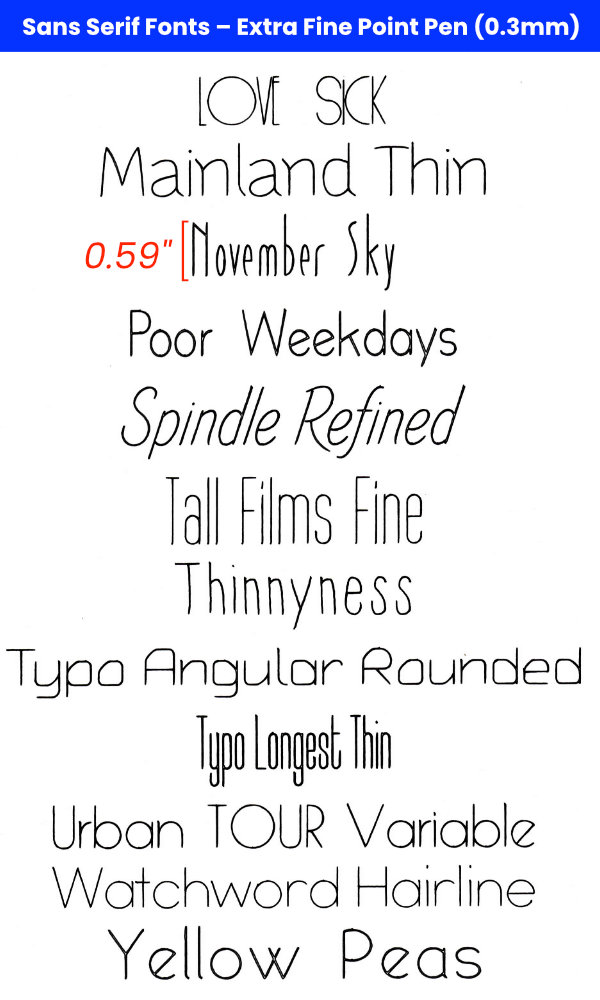
The second set of fonts should be written with a Fine Point (0.4mm) or thicker pen.
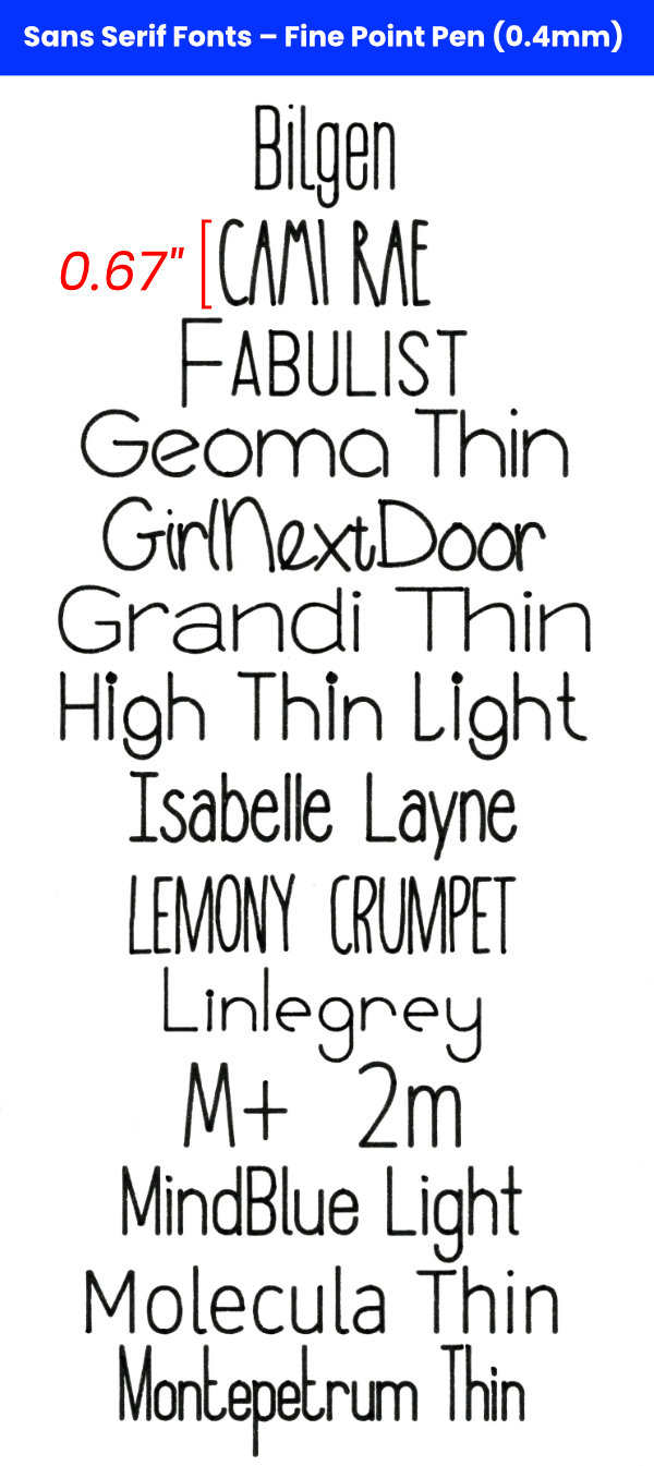
- Bilgen
- Cami Rae
- Fabulist
- Geoma Thin
- GirlNextDoor
- Grandi Thin
- High Thin Light
- Isabelle Layne
- Lemony Crumpet
- Linlegrey
- M+ 2m Thin
- MindBlue Light
- Molecula Thin
- Montepetrum Thin
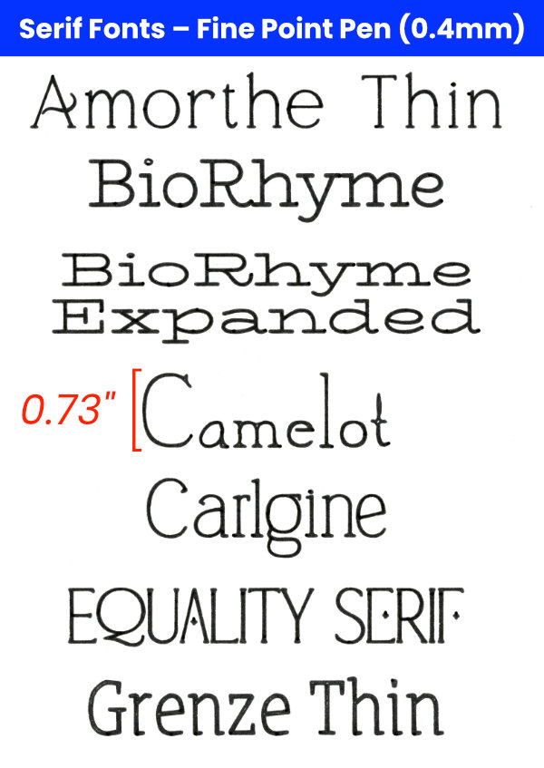
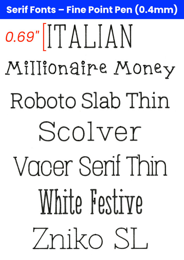
Free Serif Writing Fonts
I love using a nice clean serif font for modern-looking cards! Some of these are particularly fancy (Equality Serif) or fun (Millionaire Money) and could be used for all kinds of projects.
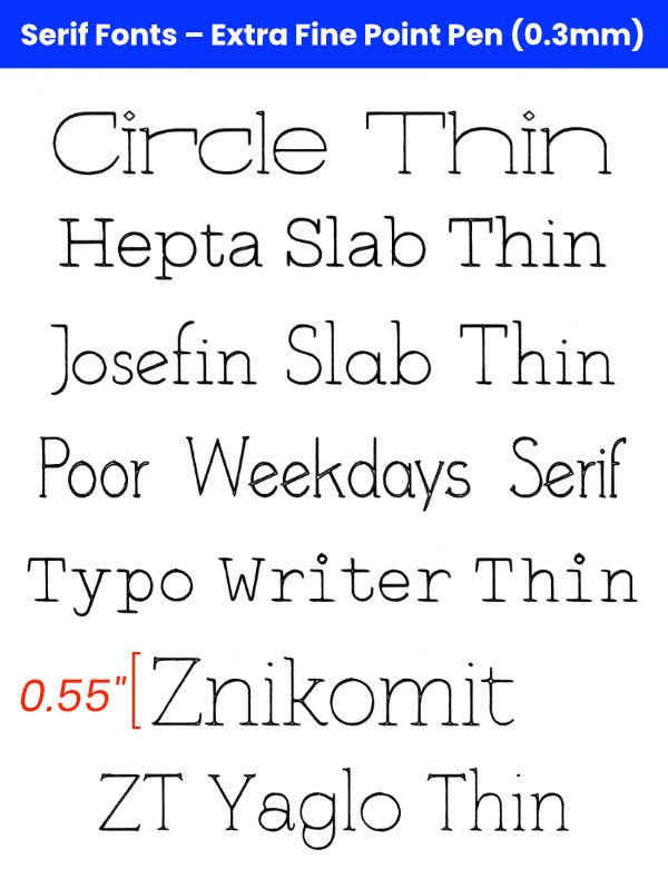
- Circle Thin
- Hepta Slab Thin
- Josefin Slab Thin
- Poor Weekdays Serif
- Typo Writer Thin
- Znikomit
- ZT Yaglo Thin
Free Single Line Studio Writing Fonts
One particular designer, Single Line Studio, has gifted crafters with a large collection of free fonts that write as a single line. These must have been created by laying the strokes of each letter on top of one another, because they are perfect and look like a single line no matter how large, written with a Cricut Extra Fine Point (0.3mm) pen.
In order to use these fonts, you must ungroup your lettering, then Attach, or the letters will not be written properly.
Single Line Studio cursive fonts

Single Line Studio sans serif and serif fonts

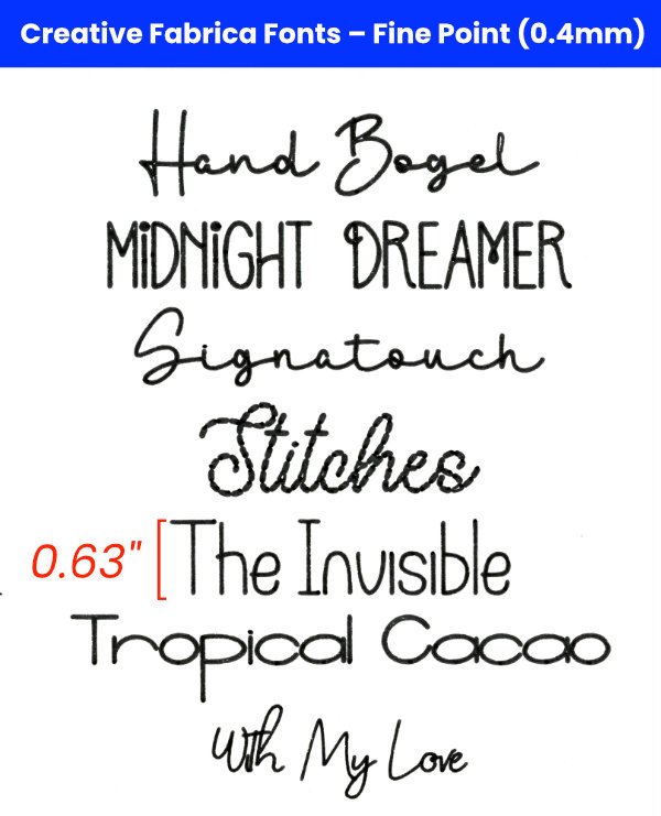
Creative Fabrica Writing Fonts
I’m not wild about Creative Fabrica’s growing collection of AI slop illustrations, but I do like having access to all their fonts. If you have a CF subscription, these are some very worthwhile writing fonts. In particular, CF has more Single Line Studios fonts, and designer Missy Meyer goes the extra mile to make sure her single line fonts are cutting machine friendly.
In order to use the fonts in the 0.3mm pen group, you must ungroup your lettering, then Attach.
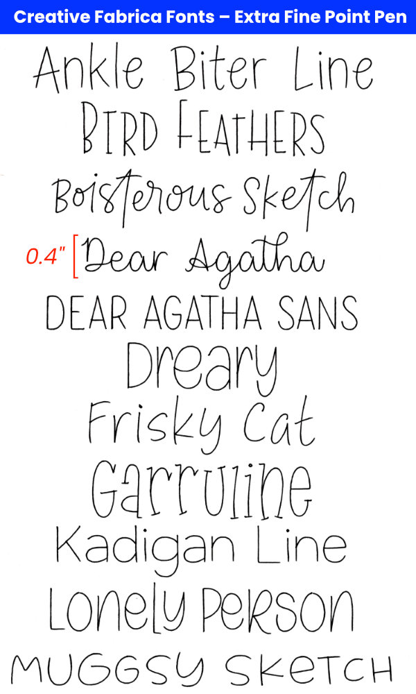
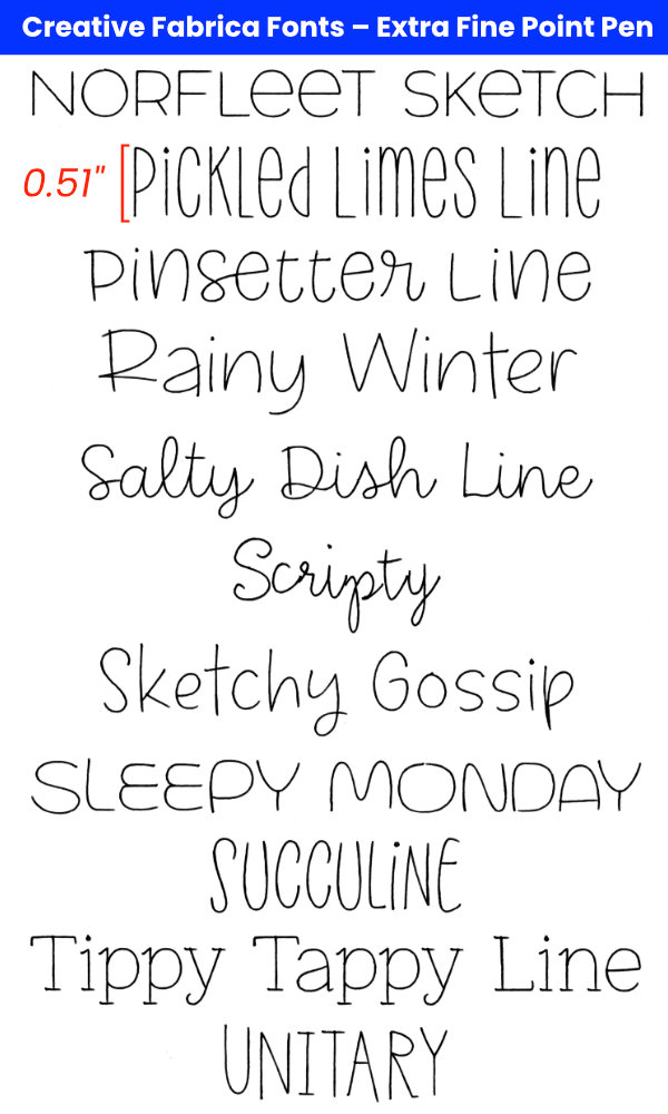
This second set of Creative Fabrica fonts is drawn in 0.4mm pen, and these are just very thin fonts that don’t need any special treatment.
Premium single line fonts by Leslie Peppers
If you need a perfect font with a full character set, Leslie Peppers of Single Line Fonts specializes in elegant fonts for Cricut, Silhouette, Glowforge and other crafting software. These write flawlessly at any size, and I have purchased nearly a dozen of them myself.
SLF also offers a collection of single line graphics like monograms, borders, mandalas and flowers.
In order to use these Single Line Fonts, you must ungroup your lettering, then Attach, or the letters will not be written properly.
Tips for using Writing Fonts in Design Space
Ungrouping and Attaching Single Line Fonts
Whether you are using free or paid single line fonts, you may run into problems in DS when you go to make your project. For whatever reason, if you simply type your text and try to use it as-is, your machine will not write it correctly – see the following screencap of Feasibly Single Line:

Your text will look broken and incomplete in the mat preview window, and your machine will write it out incorrectly. To fix it is simple: simply UNGROUP your text, then ATTACH:
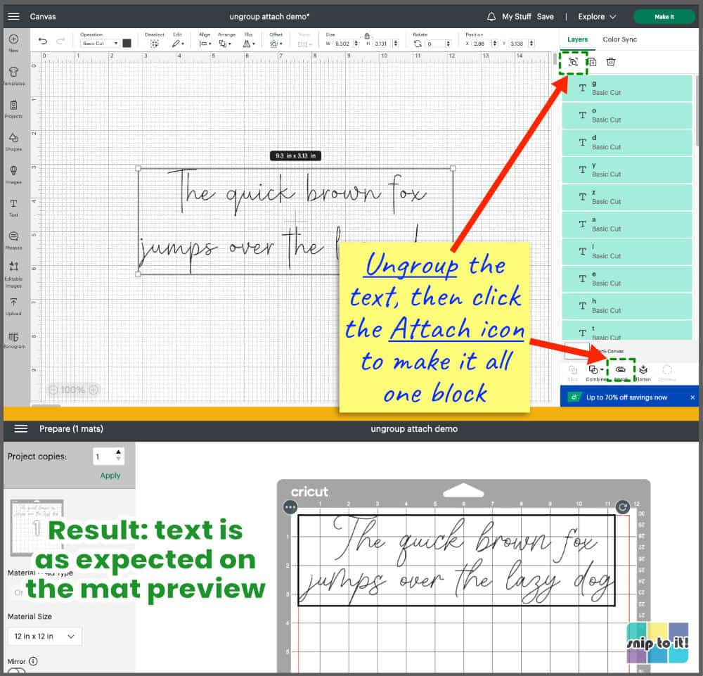
Your text will now write correctly. Anytime you have problems with writing fonts, try ungrouping then Attaching.
Tips for fixing bubble or hollow letters in Cricut
There are a few different tricks you can try to overcome the hollow letter look when using a thin, but not perfectly single line, font. The font will look better in a smaller type size. If a font has a few tiny gaps when written with a fine tip pen, try switching to a thicker pen like a Cricut 0.8mm Glitter Gel Pen or a 1mm Crayola marker.
Other methods to get any thin font to look better when drawn:
- Try duplicating your text layer, and aligning it exactly over the original layer. Sometimes a second pass over the text will darken the lines enough to fill in the gaps.
- If a second pass doesn’t work, you can use the offset function in Cricut Design Space to set an offset line inside the text! Highlight your text, click the Offset icon in the top menu bar and set a negative value. I was working with fairly small type, so I set the value to –0.02″ or –0.015″. You can check out our full tutorial on how to fill in letters with a pen.

Pictured fonts: New Orleans, Windsong, Alien League
Before you go…
We hope this article has given you lots of ideas and resources for creating beautiful text projects with your Cricut, Silhouette, or other machine. You might like to check out our other font-related articles:


Thank you so much!! 🙂
You’re welcome, Connie! What’s your favorite font for Cricut or Silhouette?
Thanks for this! Can you share what kind of pen you used for the Test Projects? I’m having some trouble with the thickness of cricut markers (1.0)
Hi Barbara,
My default pen for most projects shown here was the basic Cricut Fine Point pen, which is 0.4 mm.
For the Single Line Font test projects, I used a combination of the default Cricut Fine Point pen (Art Deco font, and the black writing for the Pinwheel project), and Cricut Extra Fine Point pen (0.3 mm) in Teal and Dark Green from the Bohemian pen set for the rest of the Pinwheel writing.
I used thicker markers (Cricut 1.0 mm and Crayola markers which are also 1.0 mm) for the free fonts that are not as fine (e.g. Better Grade, etc.).
From my own experience, the Cricut metallic markers (also 1.0 mm) really seem to spread out on textured cardstock, so I use those sparingly if I want finer lines.
In a pinch, Crayola markers give a finer line than the 1.0 mm Cricut pens. Compare the first set of “second tier” fonts I did with Crayola, like Andalusia, with the second set of “second tier” fonts that I did with the Cricut 1.0 mm pen (e.g. Asmelina Harley).
Hope that helps! Thanks for reading – Ian
This was soooo helpful! I learned so much from this post. I was getting so frustrated with the limited number of fonts for writing and you have opened up a whole new world to me. Thank you!!!
Hi Michelle,
Thanks for reading, I am so glad that you found the post helpful! – Ian
Thank you, thank you, thank you!!! You answered all of my questions so now I feel confident moving forward with my projects.
You’re welcome Lori!
HI there,
great info! thanks. I’ve been looking for info about the size the pens can write in–i.e., how small can you go? is there a list or do I just have to figure it out myslef? Thanks!
Hi Jenn, thanks for the question. I usually don’t write super small in the cards I make, so I wanted to run a test to check this for you.
I chose 3 basic fonts: Cricut Sans (sans serif), Love Quinn (serif), and Alyssa Script (script). Each font is written in 6 point, 10 point, and 12 point type using both Cricut Fine Point (0.4mm, black) and Extra Fine Point (0.3mm, purple) pens. I figured most people wouldn’t be going smaller than 6 pt type.
As you can see from the scan, the Cricut pens can write pretty tiny, with all fonts being legible at 10 pt size. The Extra Fine Point/0.3mm pen did a slightly better job than the Fine Point.
Font choice makes a big difference. As a general rule, clean sans serif or serif fonts are going to be better in small type sizes, and many script fonts aren’t going to look good at that size. Display fonts (especially ones like Fir Tree or Snow Days that have small images as part of the font) don’t look good at really small sizes. In the kerned and unkerned Cricut font guides I created, font names were written at either 3.25 inches wide or 0.5 inches tall, depending on what fit more evenly on the page, and you can get a pretty good sense of which of these font types is going to look terrible the smaller it is.
Nugo Sans is a free font that would probably look great in very small point writing. Anyway, this was a great question – I might write an article about best fonts for small writing in the future.
Thanks for reading! – Kerri
I love this art deco frame. What is it called? I’d like to look for it on cricut.
Thanks!
-B
Hi B,
The frame is a Cricut image called “Rectangle Botanical Frame”, #M1BA6249B. The image set is called “Geometric Botanical Frames” and is available to Access members. Thanks for reading! – Ian
I found the Four Seasons font in the fonts on DS and when I changed it over to Pen in the settings, it turned into the outline instead of the single line writing. Is there something I’m doing wrong? I thought these were supposed to be single lines and not outlines. Thanks!
Hi Monica,
I tested this font and here’s the likely issue. You need open the Style menu next to the font name and select “Writing” instead of “Regular”. Even when you have the operation set to use the Pen, it will write an outline of the font if you don’t have writing style selected. Hope this helps! Ian
This is so very awesome . Thank you so much!
Thank you, Sharon! Always happy to help my fellow crafters! – Kerri
Thank you for the compilation of fonts. Where can I find the single line printable fonts you mention in the article?
Hi Nancy,
We have a printable guide to the entire collection of Cricut writing fonts in our Resource Library here: https://sniptoit.com/resource-library/. Go to the library and scroll down past the HTV time/temp guides and the writing fonts guide is right there. Thanks for reading! – Kerri
I have searched for hours (across several platforms) for the information you compiled in this one post. Your post is thorough, generous, and multi-layered. THANK YOU for sharing the wealth of information and the links to the resources all in one place. Absolutely amazing resource!!!
Thank you so much for the kind words, Cruz! I love fonts more than any other design element, and there’s nothing worse to me than generic lists of fonts that have not been field-tested by writing, cutting, or foiling on a Cricut. Thanks for reading, and keep checking back – I’m always planning to add more font lists and other resources! -Kerri