This tutorial is part of the advanced techniques section of the Mastering Cricut Design Space learning hub.
Ian and I love text-focused design. We are always devising new ways to style lettering for cards, shirts, and decor. In this tutorial, I’ll show you a cool Cricut text technique to create elegant, custom intertwined text.
You only need basic Design Space tools: Slice, Contour, and Unite. I’ll walk you through the whole process step by step as I create a dreamy, romantic wedding congratulations card.
(You can also find a bunch of sample projects for inspiration and tips at the end of the tutorial!)
Are you ready to boost your Design Space skillset and start styling text like a pro? Let’s get to it!
Creating intertwined text in Design Space
These are the basic steps we’re going to follow to create our text effect:
- Select your fonts and arrange the text
- Slice the text and color code the layers
- Use the contour tool on the top (script) text
- Use the contour tool on the base text
- Fix internal cut lines
Select your fonts
The intertwining technique can work with many different kinds of fonts, but the top text should be something that has loops or swashes to curve around the base text. I prefer base text that isn’t too thick and heavy, which matches nicely with elegant scripts.
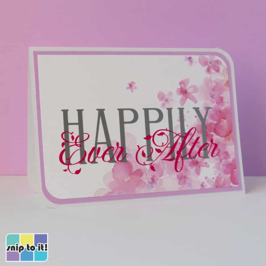
I chose a sentiment and fonts that match this wedding congratulations card: romantic, ethereal, graceful.

I’m using a base font called Aunofa Serif. It’s a tall, narrow (condensed) font that has high crossbars, leaving lots of room for my script font to intertwine at the bottom of the letters. The script font I chose is Fleur De Leah, which has lots of looping opportunities.
You can get both these fonts for free, and you can get a list of great fonts for intertwining from our intertwined monogram article:

Arrange your text
I added a 0.015″ offset to HAPPILY just to thicken it a bit. Make sure your script text is the top layer, and Weld it to make sure it’s all one shape.
The next step is to resize and position the text. I placed Ever After at the base of HAPPILY to maximize legibility. It’s important to decide which loops and curves of the top text you want to appear behind the base text. I’m going to focus mainly on the big loops of the capital E and A circling around the H, P, I, and L, then I can also look for pieces of the lowercase letters (like e) that I can intertwine.

Slice your text layers
[Note: when I am selecting a layer, I ONLY click it in the Layers panel. I don’t want to accidentally move or resize any of my layers, so clicking them in this panel is better than selecting them on the canvas.]
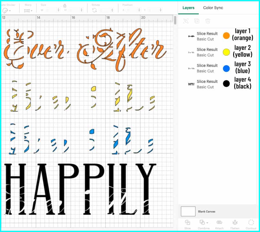
Select both layers of text and click Slice at the bottom of the Layers panel. Now there are 4 layers, and I’m going to give each of them a different color so I can keep them organized:
- Layer 1 (topmost layer): the parts of the script text that don’t overlap anything – I’ve colored this orange
- Layer 2: the parts of the script that overlap the base text – I’m leaving this yellow
- Layer 3: the parts of the base text overlapped by the script text – I’ve colored this layer blue
- this layer is exactly the same as layer 2
- you won’t see layer 3 unless you delete parts of layer 2 above it
- Layer 4: the parts of the base text that aren’t overlapped by anything – I’m leaving this black

The next screenshot is what the 4 layers look like pulled apart. Layers 2 and 3 are exact duplicates, with layer 2 belonging to the top script, and layer 3 belonging to the base text.
Putting the text back together into the 2 script layers and 2 base text layers, I’ll take you through an overview of the next steps where we use the Contour tool.
What we’ll do first is use Contour to hide parts of the yellow layer wherever we want it to look like the script is behind the base text.
The we’ll use Contour to work on the base text. We will fill in the base text by keeping every piece of the blue layer corresponding to a deleted piece from the yellow layer. All the other pieces of the blue layer will be hidden, which will create gaps for the script text to sit in.

In the end, we will have a script layer and a base layer that fit together like puzzle pieces (a knockout design).
Modify your top text (Contour + Unite)
First I’m going to move the whole design to the bottom of the canvas window so I can see it while I have the Contour window open. I will be using the design on the canvas as a guide for the selections I make.
Select layer 2 in the Layers panel and open the Contour window. This is the yellow script layer, and we’re going to hide all the parts of this layer that we want to appear looped behind the base text.

Click to hide each part of the script that you want to appear behind the base text. I’m hiding parts of the capital E and A and the lowercase e’s.

Close the Contour window. Select layer 1 and layer 2 in the layers panel and Unite (Combine menu at bottom of Layers panel). This will be the finished script layer.

Modify your base text (Contour + Unite)
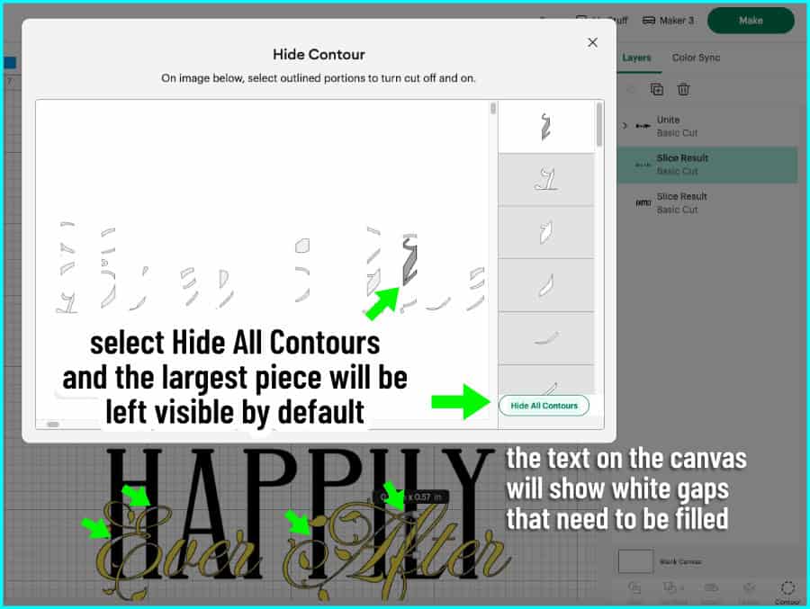
Next, select the blue layer (layer 3) from the Layers panel. Since we united layers 1 and 2, layer 3 is now in position 2 in the layers panel.
Open the Contour window and click “Hide All Contours”. This will hide all but the largest piece of the layer (which will look dark grey), and you will now see a bunch of white gaps in the design on the canvas.
I’m going to fill those white gaps by adding back the pieces of layer 3 that correspond to the hidden pieces of layer 2. We will keep the rest of layer 3 hidden to create a knockout where our script pieces will fit.
Click on each segment of the blue layer corresponding to the white gaps, and you’ll see the gaps on the canvas turn blue as you fill them in. Last, click to hide the largest segment of the blue layer, then close the Contour window.

Select layers 3 and 4 (blue and black) from the Layers panel and click Unite from the combine menu. Now the base text layer is complete. You can now see the intertwining effect between your base and top text!

Fix internal cut lines
Sometimes when you unite sliced pieces back together, they show an internal cut line between them. I’m going to change my base text to a lighter color so I can check all of my text for these internal cut lines.

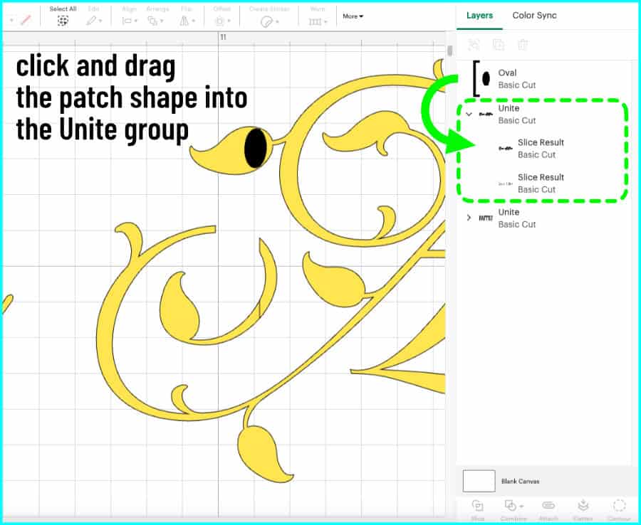
In order to fix these, I’m going to select a shape from the shapes menu and use it to patch the little cut line. Zoom in really close to get a good view of the cut line.
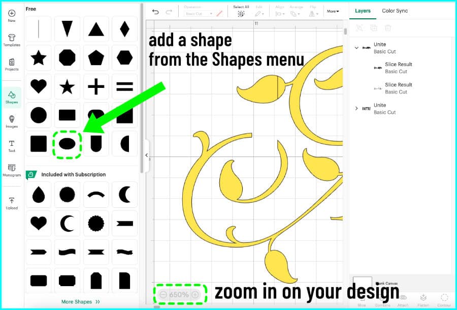
Select a shape then resize, stretch, and maneuver it into place so it covers the cut line.

When you’re finished, select the shape in the Layers panel. Click and drag it into the Unite group for the layer you’re patching. In this case, I click and drag the Oval layer into the Unite group for layers 1 and 2.
Once you’re finished patching any little cut lines, your design is complete! The knockout design will fit together like puzzle pieces and the text will appear to be intertwined.

Cut the knockout design and assemble your project
I like to use intertwined text designs either as Print Then Cut images, or cut out of vinyl or HTV. For this card, I’m cutting HAPPILY and Ever After out of Cricut Value Vinyl.
First, I transfer the base text.
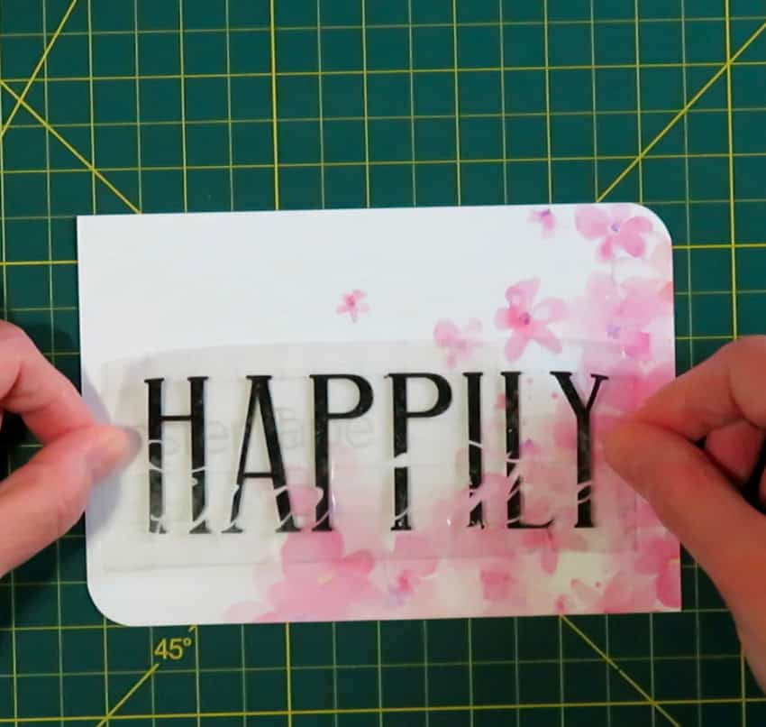
I’m transferring the vinyl to cardstock so I’m using a barely-sticky old piece of transfer tape. I use an embossing stylus to burnish my letters down so I don’t push the transfer tape into the paper.

Next, look closely at how to fit the script text into the gaps in the base text. I cut Ever and After apart so that I can maneuver each one into place separately. I don’t need to worry about word spacing because there is only one way that the top text will fit into the gaps in the base.
Take your piece of transfer tape with the top text on it and hold it over the base text, tilting it until you find the correct angle that makes all the pieces match up.
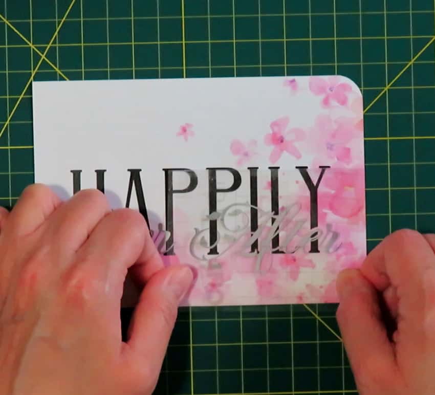
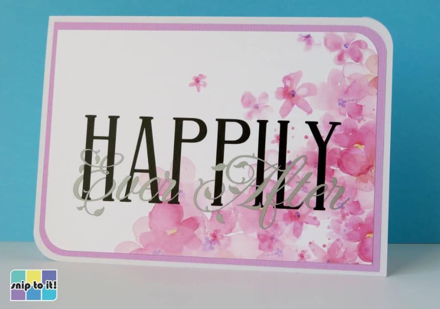
Once I transfer my text, I just stick my panel to the card base. It was so easy to make such a beautiful design!
I liked how Ever After in silver vinyl looks dreamy and ethereal, but if you’d like to see it another way, keep scrolling…
More intertwined text projects: tips & inspiration
There are so many possibilities with this simple technique!
After doing this technique many times, I have found that a darker color for the top text can really make the intertwining stand out. This is the same wedding congrats design, but with HAPPILY in silver and Ever After in hot pink:
Because these are knockout designs where no pieces of the text actually overlap, you can feel free to use textured, thicker, or different types of vinyl in your designs. This card features “CONGRATS” cut out of Cricut textured metallic vinyl, matched with “You did it” in plain Premium Vinyl.
Fonts: Girassol Regular intertwined with Luxurious Script

This anniversary card features another metallic vinyl for the base text with a black vinyl script overtop, which really highlights the interweaving effect.
Fonts: Wonder Bright interwoven with Autumn Flowers

If you want to get a little trickier, you can use more complex fonts like this varsity typeface, which has an outer stroke. Interweaving these fonts involves exactly the same steps, but you can hide parts of the top script behind either the inner or outer parts of the base text.
Fonts: Varsity Narrow interwoven with Pinyon Script
Cutting and assembling these knockout designs is pretty easy, but if you want to make it even easier you can just turn your interwoven text design into a Print then Cut project!
Fonts: Ophelia interwoven with Luxurious Script
I hope you found this tutorial helpful! If you try this technique, please show me your project down in the comments, and of course don’t hesitate to ask if you have any questions!
For more Design Space tutorials to flex your creativity, you might like these: