
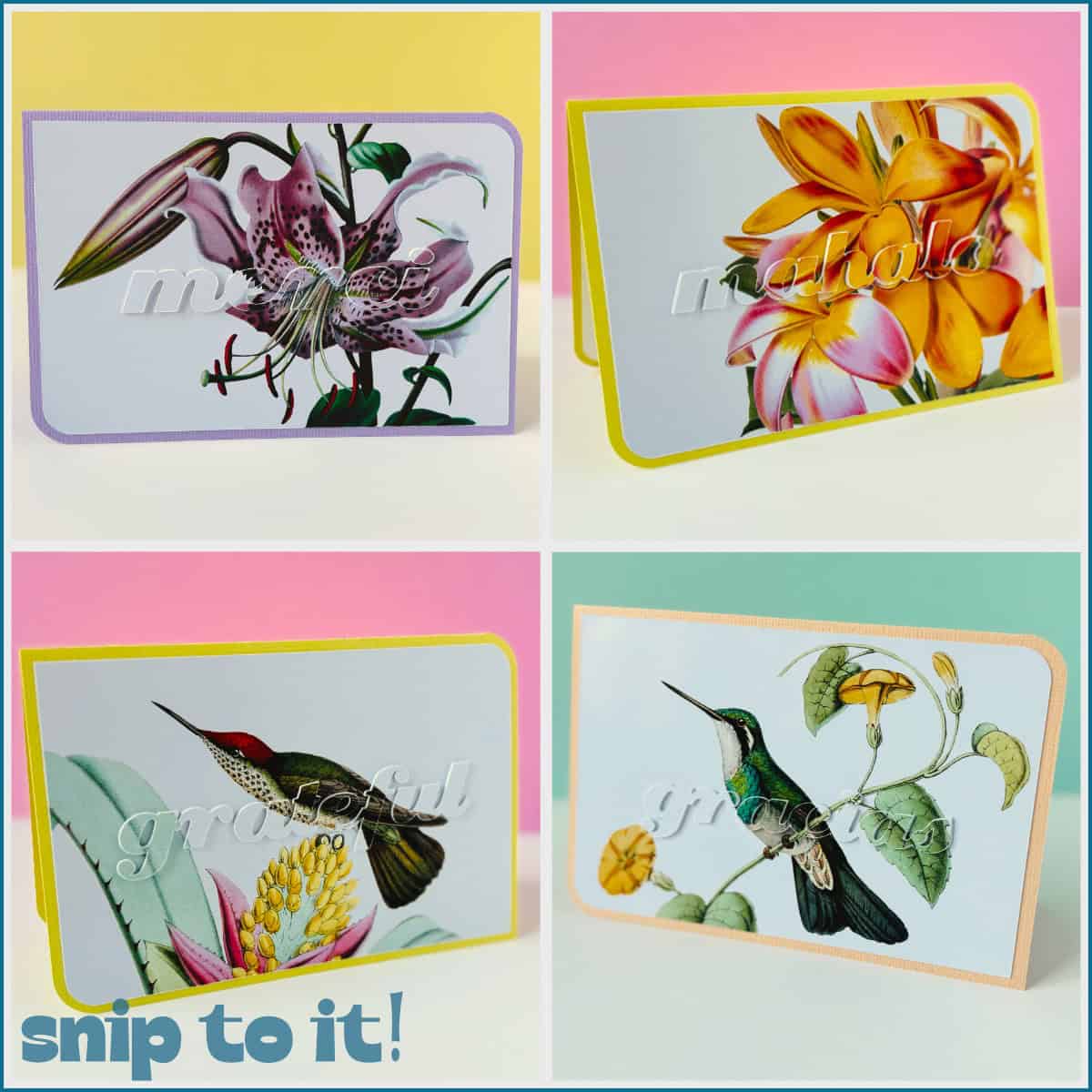
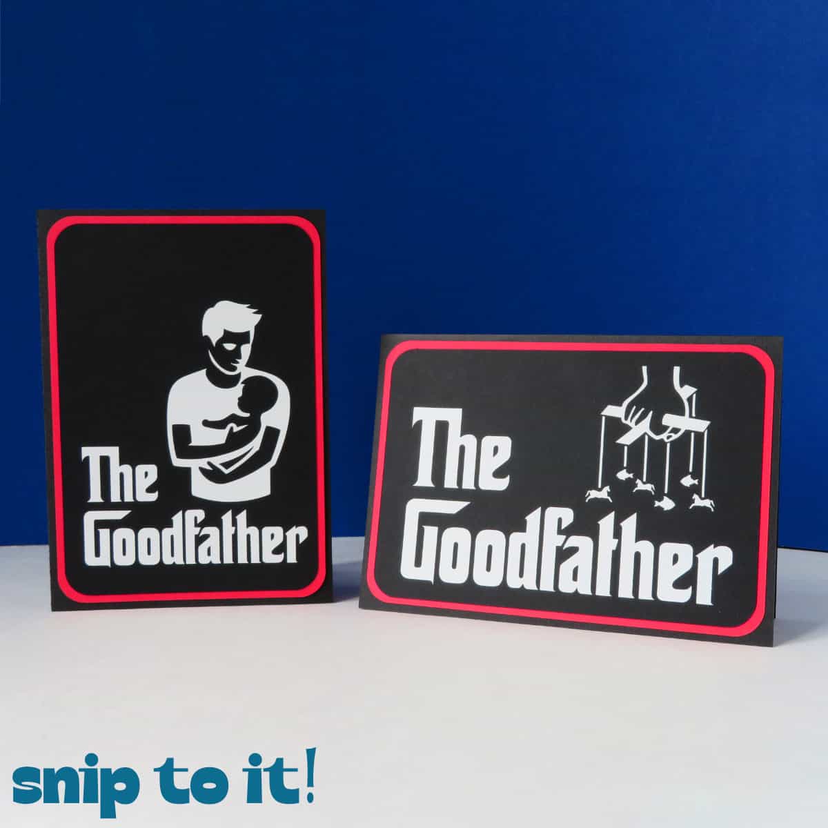
Eclipse cards feature text cut out of an image to create dimensional yet clean and sophisticated designs. Whether you’re making a card for weddings, Mother’s Day, sympathy, or other formal occasions, these designs look professional and elegant but are incredibly easy to make.
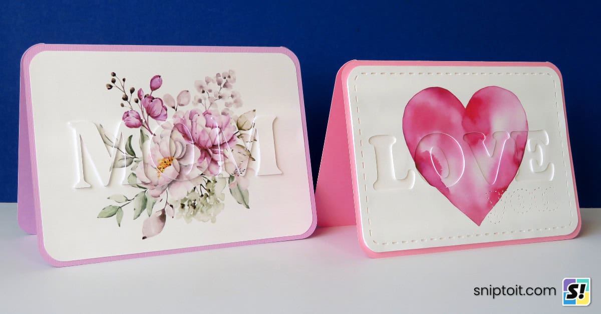


In this tutorial, I will show you how to make 2 types of eclipse cards: a raised text version and a recessed text version. Pairing watercolor images with dimensional text, this is a great Print Then Cut project, even for beginners.
How to create a raised text eclipse card in Design Space
First I’ll show you how to design classic eclipse cards with raised text cut out of an image.
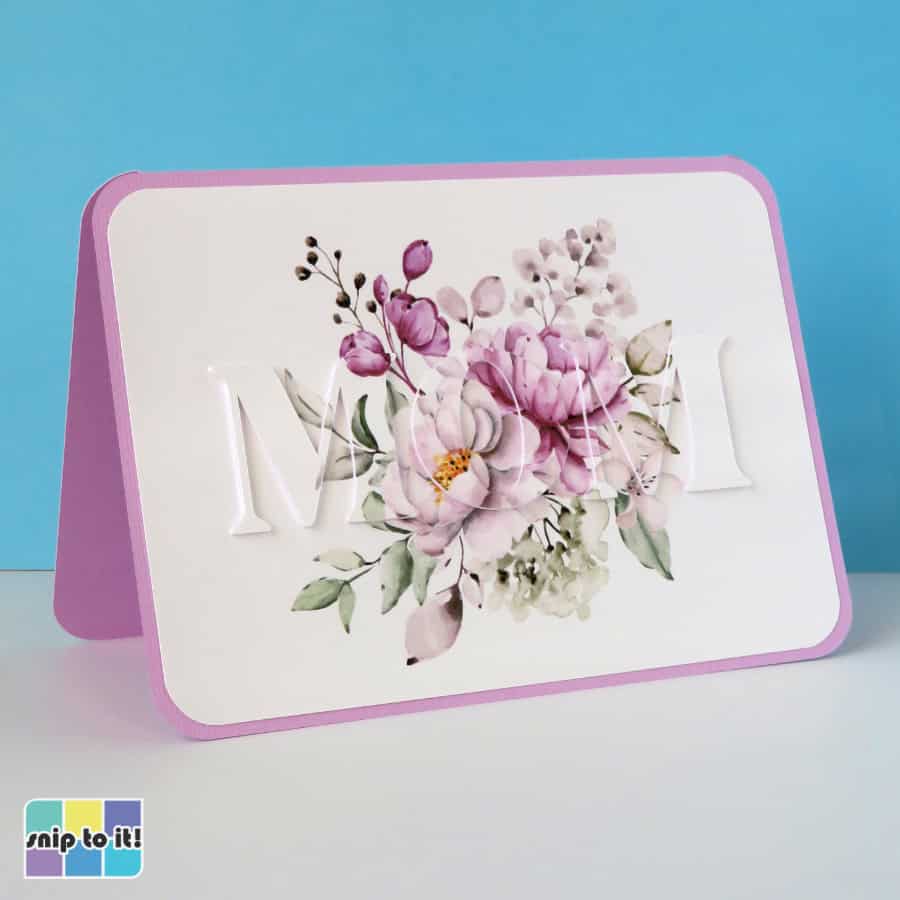
Start by uploading your image and adjusting the size. I resized my image to 6.75 x 4.75″ to fit on a 5×7″ card base. Next, type out your text and choose a font. A thick serif font is always nice for these kinds of cards, and I’m using a font called Bright. Position the text over the image. I centered my text and made it big enough so that it will include parts of the image and white space on either side.
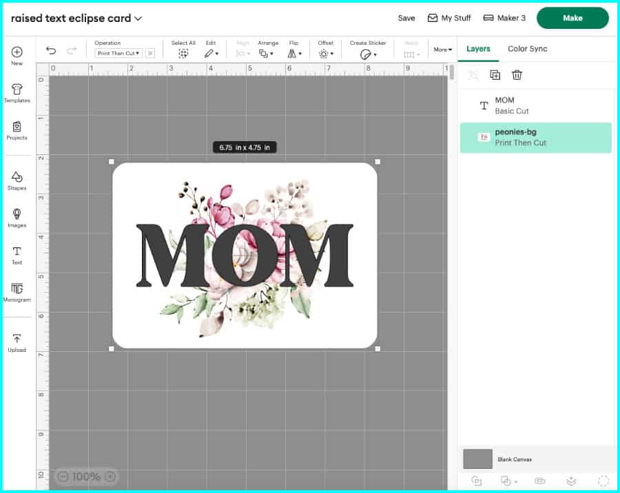
Now, duplicate those layers so you have 2 copies of the text + image. One of these copies will be used to cut out the text, and the other is going to serve as a base for the layers of text.

Slice out the text
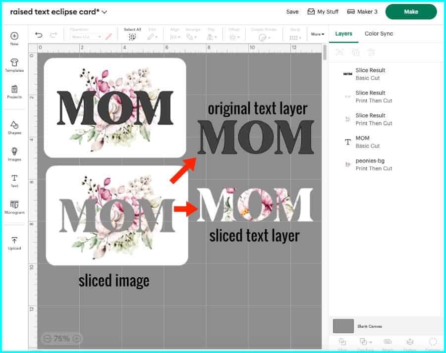
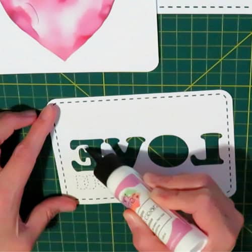
Now I’ll cut out the text from one of the duplicates. Select the text and image layers, and click Slice.
- the top layer is the original text – keep it to make your spacer layers
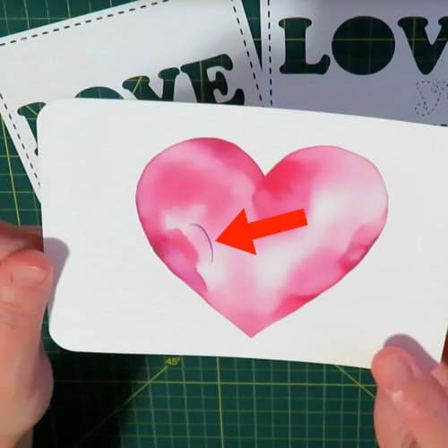
- the next layer is the text sliced out of the image – this will be your top layer of text
- the final layer has the image with text cut out of it – you can delete this layer*
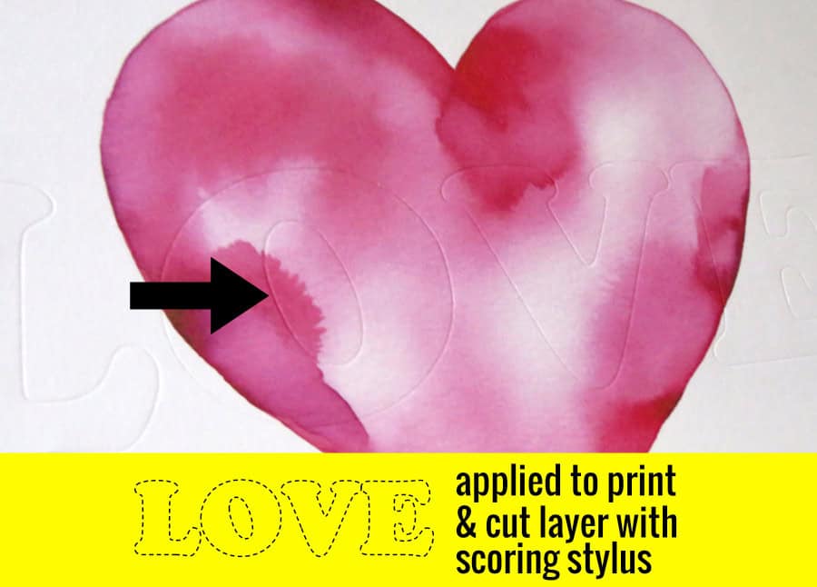
* most other eclipse card tutorials will tell you to use the layer with text cut out of it as your base, then use foam tape or spacers to raise the letters that you cut out of the image. I don’t like this technique because I think it can look like it has a dark offset around the letters. Instead, I use the duplicated image with a score line around the text as my base so my top text is perfectly camouflaged.
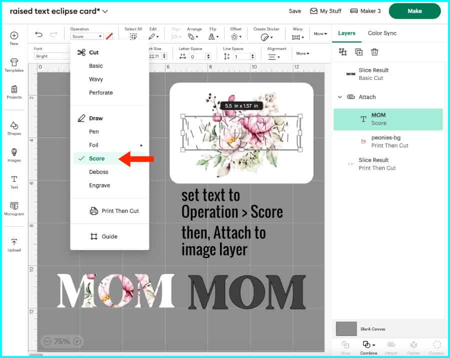
Create a scored base for the text
Using the second copy of your text + image, select the text and set the Operation to Score. Select the score line and the image and click Attach.
Now you will have your image with a score line marking the text. You can use the score line as a guide when you glue down each letter.
Create spacers to elevate the text
Instead of foam tape, which is annoying to use under thinner parts of text, I use cardstock or kraft board copies of my text to make it 3D. Typically I use 3-5 layers of medium cardstock or maximum 3 layers of kraft board as spacers for layered lettering. For this project, I’m going to make my text nice and high using 3 layers of kraft board.
Duplicate your original text to create as many spacer layers as you want. The card base I’m using for this project was designed in another program so I uploaded it and I’ll add it to the canvas as well.

Making a card base in Design Space is simple: add a rectangle and the score line (first option in the menu) from the Shapes menu to the canvas. Resize the rectangle to what you need, e.g. 10 x 7″ for a final 5×7″ card, and set the score line to, e.g. 7″. Center the score line on the rectangle to create the fold of the card and Attach.
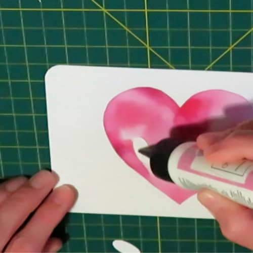
Now it’s ready to Make! The top layer of text and the image base panel will be on one print & cut sheet – I click to Add Bleed when I print so I can avoid any unwanted white borders on the text.
Assembly of the raised text eclipse card
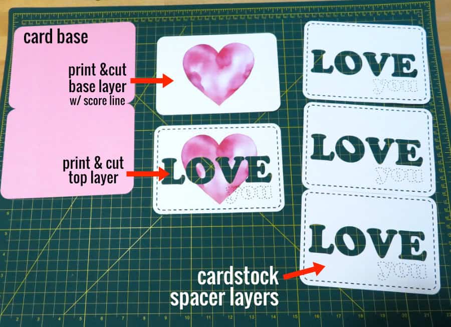
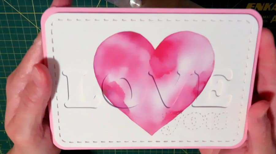
Assembly of these cards is really straightforward, all you have to do is stack your letters! After cutting, I have my card base, image base, top layer of text, and 3 spacer text layers.

I am going to build my letters from the base up, adding glue inside the score lines of the image base and applying the first layer of spacer text. Be careful to apply your text within the score lines.

This is my first layer of spacer text added to the image base:

After that, I will apply my next 2 layers of spacer letters and then top them with the printed text. I always apply glue to the base letter, then align the new layer on top of that.
After the eclipse image with its 3D text is assembled, I use tape runner to stick it to my card base, and I’m done!

Which glue to use? I use the same 2 glues for cardmaking that almost everyone else does: Art Glitter glue and Bearly Art glue. I like them both, but Bearly Art comes with a metal tip applicator that is great for small details. Use a very small amount and your cards won’t warp. When I first started Cricut crafting I thought people were crazy for paying so much for glue, but I was totally wrong and I will never regret kicking thick, annoying Tacky glue to the curb.
I use dollar store tape runners for everything else, like putting big layers together.
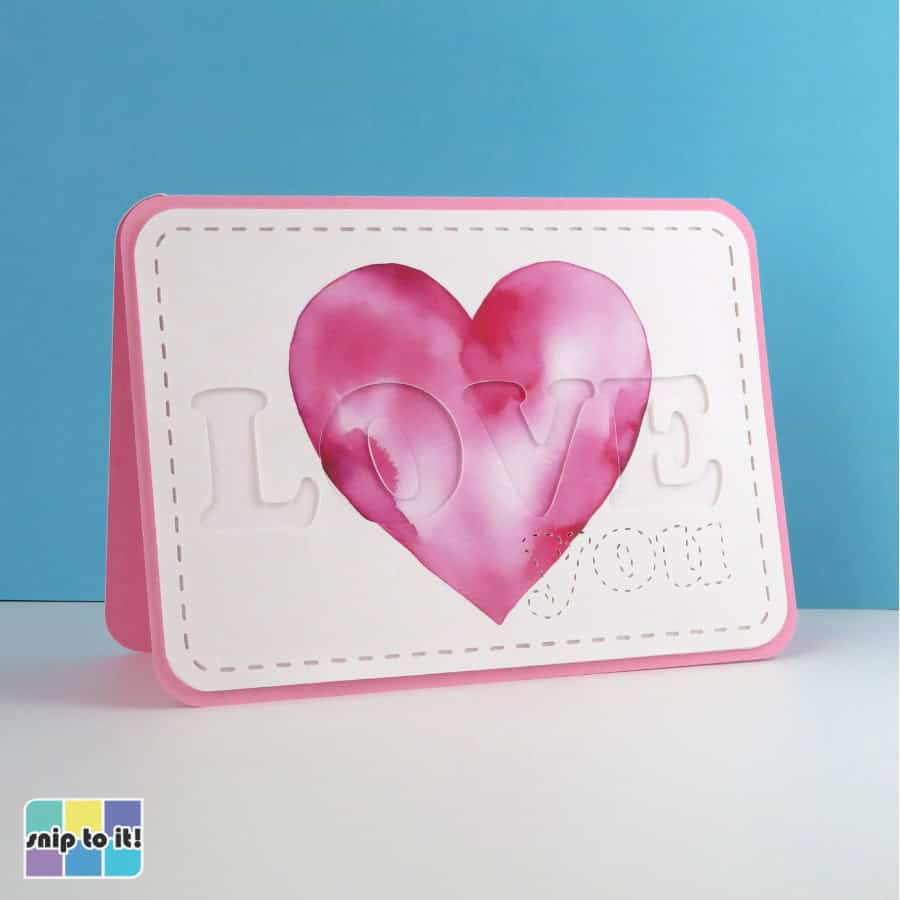
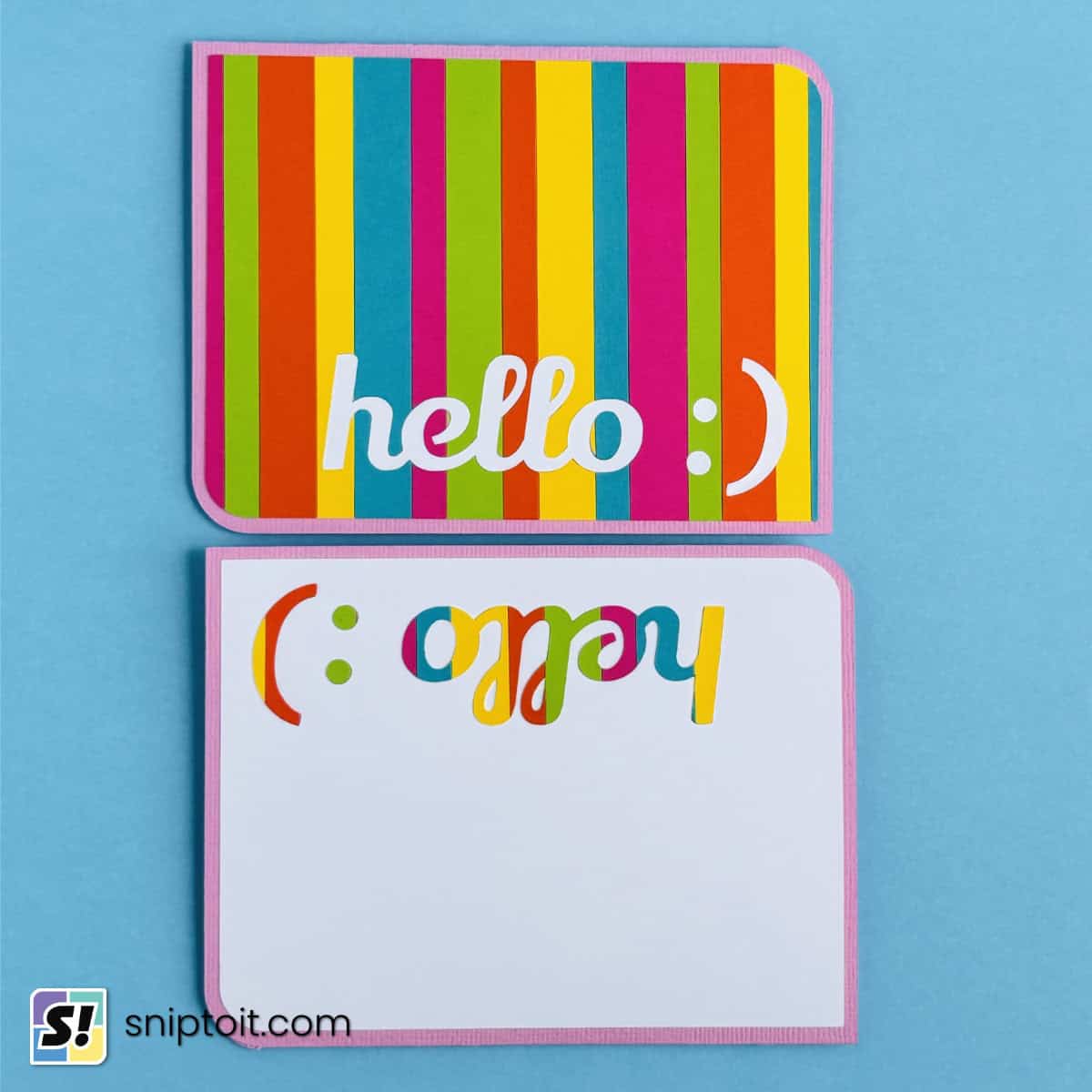
How to design recessed text eclipse cards
These cards are even easier to make than the raised text ones, because you will be stacking full panels with the lettering cut out.
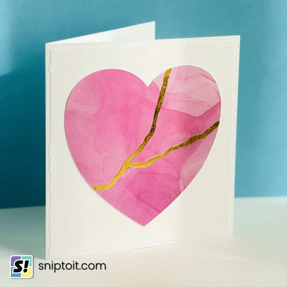
Upload and resize your image in Design Space. This watercolor heart image has a background already and I’ve changed the width to 6.5″ to fit on a 5×7″ card. Type out your text and choose a font – I’ve chosen another thick serif in classic Cooper Black. Position the text wherever you want, I’m centering mine again.
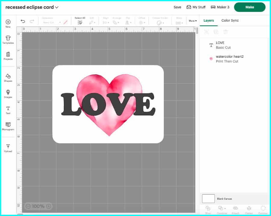
Select the text and image layers and click Duplicate.
Create the scored base layer
For the copy that will be your base image, select the text and change the Operation to Score, then Attach the score line and image.

Slice out the text
Using the second copy, select both layers and Slice.
- You can delete both the text layers (original text and the text cut out of the image).
- Keep the layer with the text cut out of it – you will also need to keep all the middles of letters (called “counters”) that are part of this layer.

Create the spacer layers
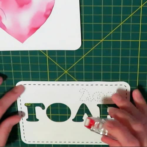
Duplicate the layer with text cut out of it and change the Operation to Basic Cut – this will be your spacer layer. Make as many copies as you need (I’m going to use 3 spacer layers cut out of 65lb cardstock).

I’m going to upload a card base and some cute stitch elements that were made in another program. The stitches are just cutouts that are all part of a single SVG. I’m going to cut the stitched elements out of all but the base layer.

Now we’re ready to click Make!
Assembly of the recessed text eclipse card
You’ll be able to assemble these super easy cards in minutes!
I’ve got my card base, my image base with the scored text, the top layer, and 3 spacer layers. Notice how I kept the middle of the O (counter) from the top layer and each spacer layer.
I’m going to build this card from the base up just like I did with my stacked text eclipse card. I will use the scored outline of my text to guide my placement.
First, I’m going to build the center of the O by stacking all the counter layers. I put a tiny bit of glue inside the score line in the center of the letter and place my first spacer. Then, I add the other 2 spacer layers and the top printed counter.
Now I’m going to add the spacers and the top layer for the rest of the card. I prefer to put the adhesives on the back of each layer instead of the base for this type of card. Mainly I use tape runner for larger areas, but I’m going to use a little glue around the letters to keep small pieces stuck flat.
Stacking the layers is easy to do because you can just align each layer at the bottom and sides. I like to stand the layers up and tap the bottom edges on the mat, while lining up the sides.

Now that I’ve completed my eclipse layers, I just attach it to the card base and I’m done!
Troubleshooting: Using an image with a transparent background
Update: if you’d like to see 2 ways to solve this problem, check out our new tutorial where we make eclipse thank you cards with flattened images!
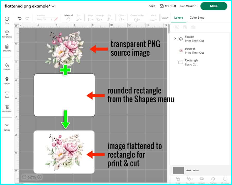
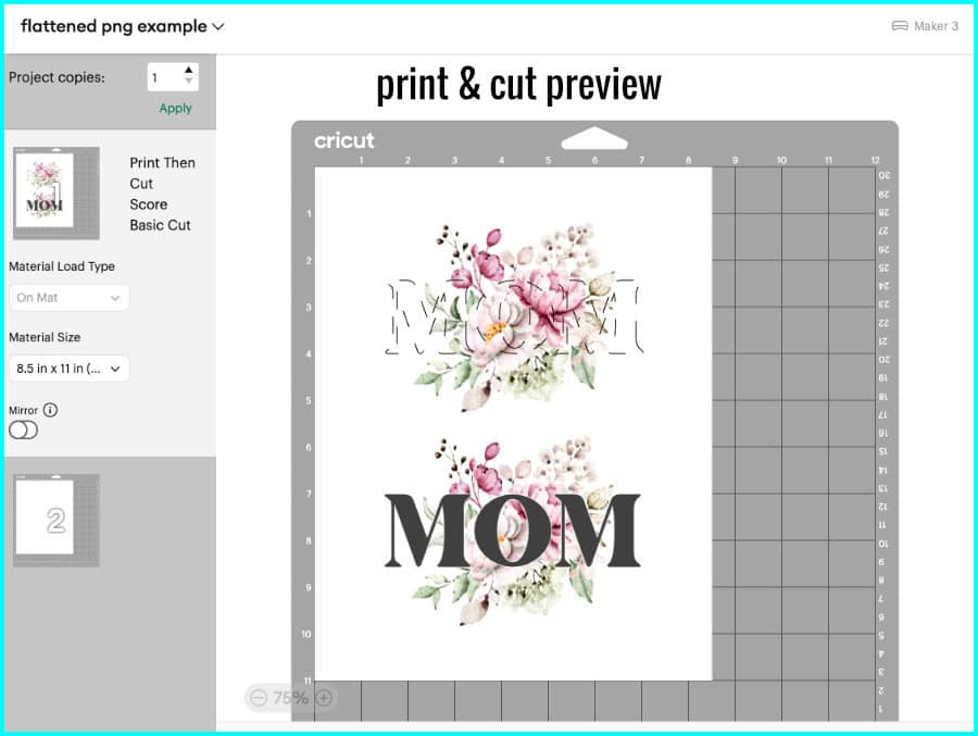
The image I used in my examples already had white backgrounds. If you want to use an image with a transparent background and flatten it to a shape in Design Space, you will not be able to use Slice. (Flattening your image to a background layer creates a single layer bitmap image that is unable to be Sliced)
So, start by flattening your image to a background shape – I’ve chosen a rectangle with rounded corners from the Shapes menu.
Type in your text, resize and position it, and Attach it to the flattened image.
Make a duplicate, select the text and change the Operation to Score. Now you have a copy that will serve as your image base, and you have a copy that will have the printed text cut out of it.
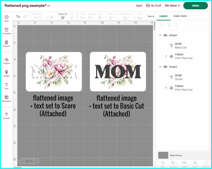
When you go to print and cut, you will be printing out two complete images, one of which will have the text scored into it and will serve as your image base, and the other will have the printed text cut out of it.
- if you are making a raised text eclipse card, keep the text that is cut out of the second image
- if you are making a recessed text eclipse card, keep the image with text cut out of it, including any counters from letters (like the middle of the O in this example)
Keep reading…
I hope you found this tutorial helpful, and I can’t wait for you to try making these cards! If you need further help, feel free to ask in the Comments below. If you’re looking for more ideas and inspiration, you might like to check out our other tutorials:
Can you tell me where you get your images? I tried uploading a flower image, adding it to a rectangle background and flattening it. Then added my text to the canvas and welded that. Then tried placing the text over the flattened image and the slice would never showed as an option. I tried over and over and it never worked. Can you tell me what I’m doing wrong?
Hi Suzanne,
Design Space sees a flattened image and treats it like multiple layers, so Slice – which only works with 2 layers at a time – isn’t an option. I don’t cover it in the video, but in the article there is a troubleshooting section that goes over this exact problem, you can find it here.
So instead of using Slice, you’re just going to Attach your text to the flattened image/rectangle and physically cut it out of the background. Make sure the text layer is set to Basic Cut, and the image/rectangle is set to Print then Cut (which it should be by default, once you flatten it). Your text will simply be cut out of the image layer, and you can keep that text and discard the rest.
Just remember to make a duplicate of the text + flattened image/rectangle and then change the text from cut to Score for the second copy – this will give you the solid background layer with guidelines for your text stack.
The images I used in the examples here were watercolors from Creative Fabrica and they originally had transparent backgrounds. I used another program – Affinity Designer – to add a solid white background to both images before I uploaded them to Design Space.
Thanks so much for reading, and I hope this helps! If you have any other questions, don’t hesitate to ask. – Kerri
Thank you so much!! That worked perfectly.
Fantastic! So glad to hear it worked out.